
6 respect: times new roman
Every once in a while I will come across something that I find truly ingenious, deserving of recognition, or simply in need of some love. Less often I will take the time to look further into it and share my thoughts and appreciation. This is one of those "less often" times.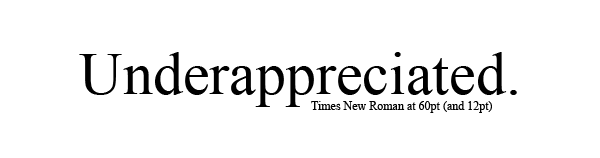
How can you use a computer and NOT know what Times New Roman is? Even if you don't know it, there is absolutely no way you haven't seen it, because it's the default serif font on most browsers and word processing applications. It's the freaking Starbucks of typefaces - by navigating away from one, you're only getting closer to another one. And much like Starbucks, TNR has also developed a stigma of sorts. It's an unfortunate consequence of ubiquity - if it's everywhere all the time, people will eventually find bad things to say about it.
The main issue I want to address is how "ugly" people consider TNR to be. I remember when I was in high school and first dabbling into the world of webdesign, my friends and I abhorred it. It was a sign of a lack of creativity; of laziness, even, for not deviating from what was considered to be "normal." In the same effect, most websites don't use TNR today, giving it up for a sans-serif font (like Tahoma, Trebuchet MS, or Arial, some of which I believe are also starting to suffer the same fate as TNR), or Georgia (which is what I use). Even Microsoft has replaced TNR with a sans-serif Calibri as the default font for their MS Office 2007 pack.
The sad truth is that there is a reason for this, but it's not really at the fault of the typeface. It's a heartbreaking story, since the only thing that TNR did wrong was exist long enough to become obsolete. Okay, it's only heartbreaking if you're a nerd like I am, or if you're really, really, really sensitive to inevitable expiry.
First, some things that are important to know:
1.
TNR was first created as the main typeface for The Times (the UK version) in the 1930's. It was designed to economize the newsprint page, which has limited space, while also maintaining the fashion of the traditional Oldstyle font (Oldstyle fonts have longer ascenders and descenders - meaning the vertical "arms and legs" of letters like "p," "b," etc. - and therefore are harder to read when printed small). This is why TNR seems taller and more narrow than other fonts.
2.
Although The Times itself doesn't use it anymore, TNR has influenced the creation of many other current serif fonts. Most notably Georgia, which I feel I've seen a lot of lately.
And, because it's interesting (kind of):
3.
The U.S. Department of State's diplomatic documents are all written in 14pt TNR as of 2004. Before that they used 12pt Courier New.
Sounds pretty legit, so what happened? Technology happened. As elegant as it is, TNR's original niche is on paper. And you wouldn't believe it, but people read differently when the words are on a computer. There are a lot of factors that affect readability on the screen, but the hugest reason for TNR's demise was that, when reduced to pixels - that is, square dots - the letters get scrunched up, the curves get too angled, and everything just looks extremely uneven. It looks pretty ugly, especially when it's something smaller than say, 14pt (and I know you all have written essays that were required to be TNR, 12pt).
While I'm at it, I'll also explain why Georgia, in contrast, is a preferred typeface on the web. It's because it was first designed in the 90's, specifically for the screen. It took into account the fact that roundness would be sacrificed with pixellation, which is why the heads and tails of Georgia are shorter, and the bowls (the round parts of "b" and "p") are larger. The openness of the typeface gives it a more user-friendly look, which in the informal world of blogging and instant messaging is likely more favorable.
TNR was created too early to have that taken into consideration. Something went awry in the transition from traditional to digital media at the expense of a very important typeface, and now it's reduced to something that's often considered unimaginative and cliché. It's really a huge shame, because the original TNR design looks great off the screen, but now it doesn't even make it that far because most printed documents are first produced on the computer.
I'm not saying that TNR needs to change, or to get with the times (no puns, please), because those really slight changes actually make a difference. If you widen TNR, even out the spacing, or anything, you're going to have something else. What I want to get across in this entry is that there is little appreciation out there for what is considered by many typographers one of the most influential, classic, and successful typefaces.
Hopefully this entry helps in giving some insight in the making of fonts. It's weird to think about, that there is actually a person or a group of people behind a lot of the so-called "boring" well-known typefaces, but I think it's important to know that a lot of time and consideration goes into the creation of something we see every day. Actually, the fact that we take good typography for granted is indicative of how succesful it is - if we can read it without even thinking about it, it's done its job. So chew on that, and please give a little love to Times New Roman, and all those other typefaces out there.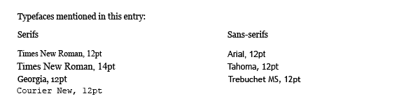
I unfortunately do not have Calibri anymore since I've switched OS', but you can see a sample of it here.
Some sites on Times New Roman; also where I got a lot of my information:
Microsoft Typography: general information about the typeface, who the designers were, etc.
Times New Roman - Wikipedia, the free encyclopedia: if it doesn't exist on Wikipedia, then it doesn't exist, period (I did cross-reference however, and as far as I know the article is correct).
The changing face of The Times: a pretty interesting article chronicling the invention of TNR for the purpose of the The Times, reader's reactions, etc.
![]()
1 comment:
That's quite a tribute. Inspiring to say the least
Post a Comment